


1
2
3
4
5
6
7
8
9

WORK TYPE
Packaging Design, Visual Identity, Icon Design, Photography
ROLE
Art Direction, Design
DESCRIPTION
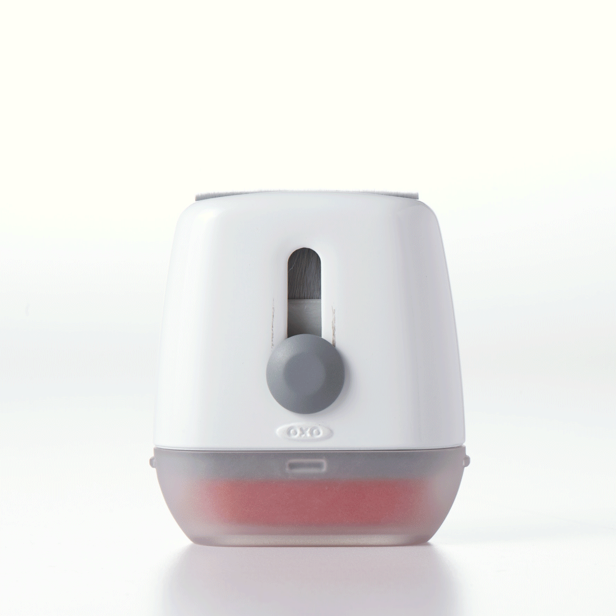
As OXO prepared to launch a new line of tech-cleaning tools—targeted for on-the-go and desktop use—I led the design of a visual identity and packaging system that would stand out at retail while staying true to the brand’s DNA.
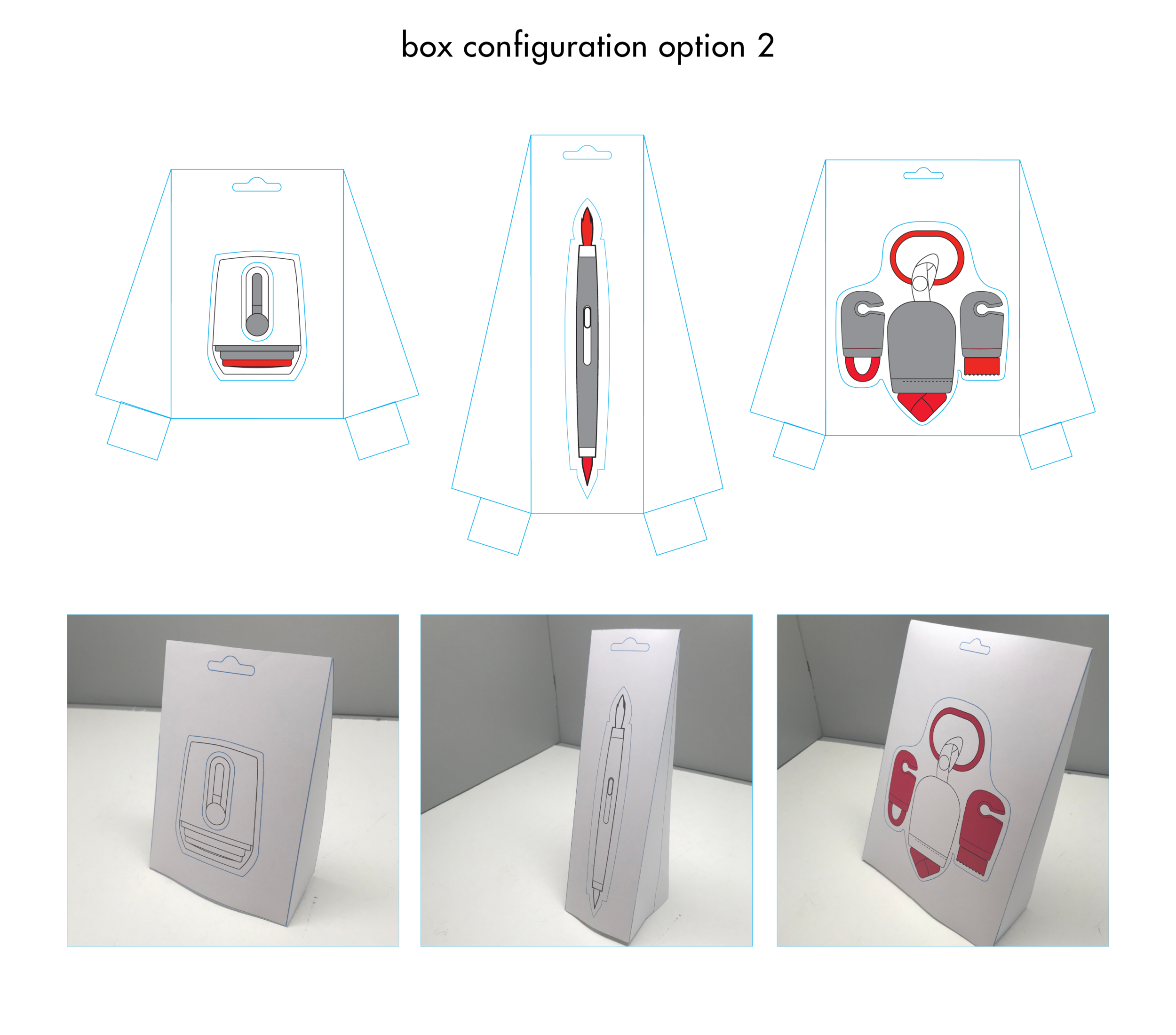
This was OXO’s first move into the tech space, and the goal was to translate the brand’s clean, functional aesthetic into something minimal, tactile, and tailored to the category. I moved away from traditional carded packaging and instead proposed a frosted plastic box—sleek, structured, and highly interactive. The structure itself invited customers to test the product’s unique details, from soft detailing brushes to precision cleaning heads.
Rather than relying on photography, I developed a custom icon system to communicate use cases—making the experience clear, streamlined, and visually distinct. Line weight and balance were critical to keep the icons feeling minimalist but informative.
I also collaborated with our internal photo team to art direct supporting visual content for social and digital. We focused on the satisfaction of cleaning—long brush strokes, crisp textures, and small spaces being brought back to life—to highlight the self-care aspect of these everyday tools.
This packaging system was built to stop shoppers in their tracks—especially at the register—and helped frame OXO’s design-first approach in a whole new category.